Category Archives: Uncategorized
Giant Leap
FIGHT! FIGHT! FIGHT!
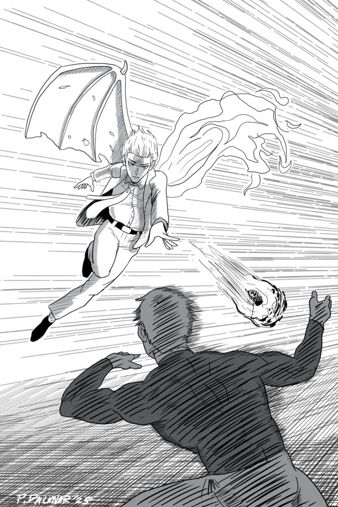
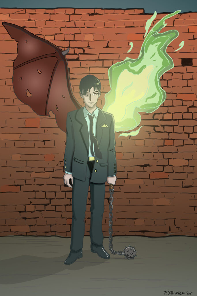
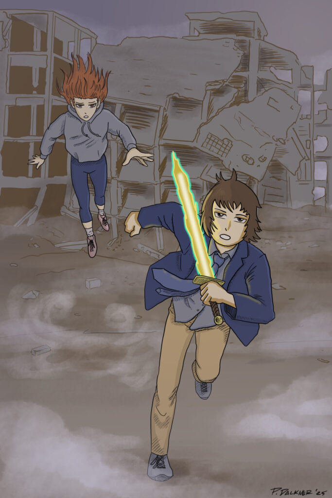
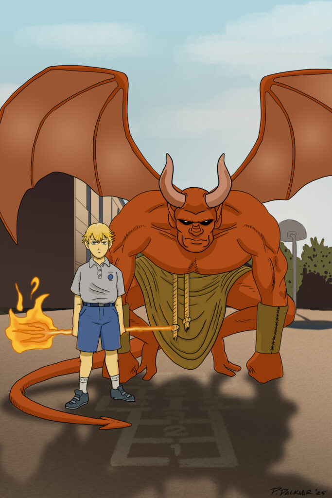
New Illustrations
Me, In The Future
Alien Sport
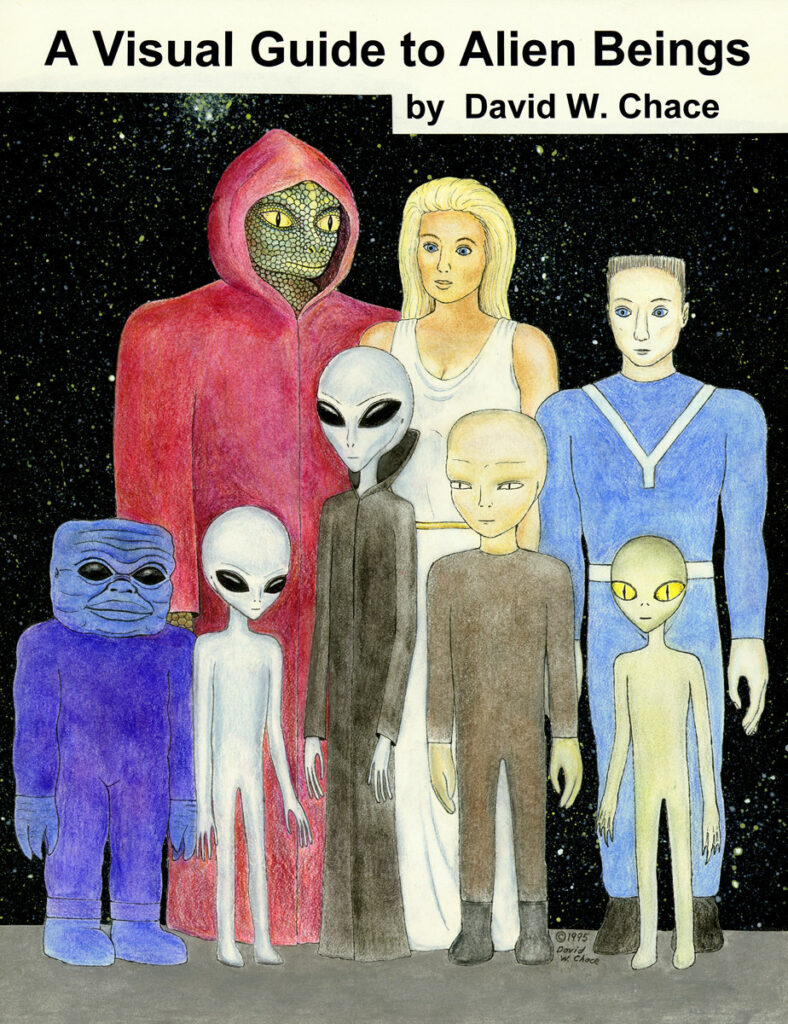
I was recently inspired when watching a Quicksand concert on Youtube. The singer/guitarist, Walter Schreifels, was wearing a cryptic t-shirt with a bunch of crudely drawn aliens on it. After doing a little bit of snooping online for “alien art” I found the source of the drawings. They come from a book called “A Visual Guide to Alien Beings” by David W. Chace, 1996. From what I can tell the author/illustrator interpreted a bunch of accounts from people that claim to have had first encounters. It made me think of every bit of alien lore from shows like Unsolved Mysteries and tabloid covers.

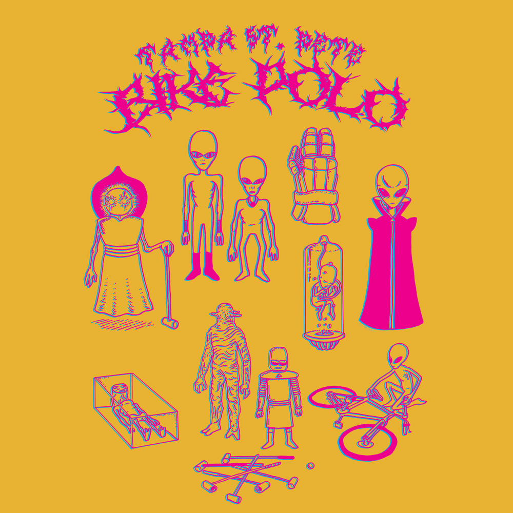
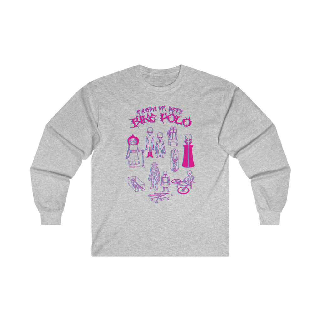
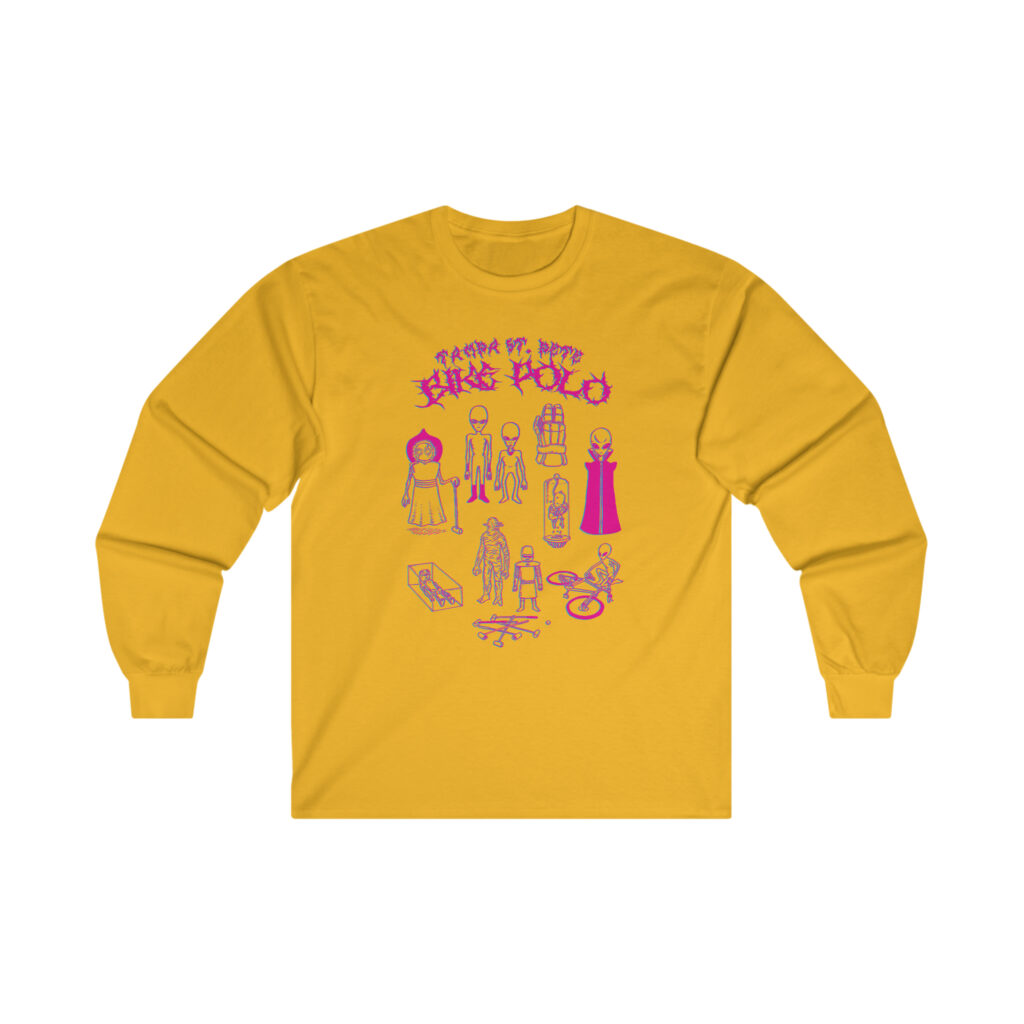
So where am I going with all of this? I thought the aesthetic was cool, creepy, and goofy at the same time. I designed and illustrated a shirt for my local bike polo club based on all of this occult-ish silliness. Aliens and bike polo gear with some metalhead drip font for good measure. Making things the appropriate amount of cryptic and curious.
The “Alien Sport” shirt design comes in three different colors; black, gold, and grey. The gold and grey shirts have and slightly offset magenta and cyan color way, the black shirt has reversed white. You can order yours here today!


Awwwww-ful
This is the third installment of a Birthday Street comics thread. When any of the three creators would undertake making a comic, they would start by working off of some element from the comic that preceded it. In this trio of animations (World’s Greatest Hotted-Dog, Quincy vs. Frankfurter, and now this) it follows through one small arc of those threads. Starting with anthropomorphic hotdogs, then treatment for (maybe) imagined anthropomorphic hotdogs, and finally the doctor character.
Hotdogs And Delusions
I’ve recently been working on translating a number of Birthday Street comics into short animations. You can see all of them on the animation page of my site. Here are a pair that feature The World’s Greatest Hotdog.
Autumn Bike
Writings about plagiarism
Professionally, I work with my wife, Eleanor. I was inspired to write a blog entry for our site about plagiarism having recently discovered an instance of such. It’s not the first time that someone has claimed our work as their own but it still stings. Before I started writing the article I reached out to one of my college design professors, Karen Kresge, to look for some perspective and help me collect my thoughts. She wrote back with a very thoughtful and lengthy response. I’m truly grateful and humbled that she could. I post it here so that I can reference it externally, in its entirety, for my own full article. Here is what she had to say on the topic of plagiarism:
I think that there are many reasons for plagiarism. And surprisingly, most of them do not stem from malicious intentions.
- Fan-girl mentality. Especially in light of the popularity of Instagram and Pinterest, where design ideas are shared and “liked” by the billions, it is easy to see how a designer might reach superstar status and be copied by young, impressionable designers. Sort of like how every 12 year old boy got the Justin Bieber hair swoop down to a science, these youngsters see a big shot like Seb Lester and think, “I’m gonna set up my Go-pro and get a calligraphy pen and get famous.” Or they saw Dana Tanamachi’s chalk lettering and tried their own hand at it. It isn’t a direct copy, but the “artists” are trying their best to emulate Dana’s work. They really don’t mean any harm, but instead of developing their own style, they just practice and copy their “design crush.”
- Mistakes. Sometimes a design will stick in your head and stay there for a very long time until it rears up during a sketch session and you think it’s your own, when really it is something you saw in Graphis or even in your Historical Survey of Graphic Design class sophomore year. I have actually had this happen myself and was scared by how close I “copied” without ever referencing the original. Thank goodness I realized before it went to the client or worse, to print!
- Clients. They are guided by a client to copy and they are too green to realize they should say no. Sometimes a client brings in something that they like and ask the designer to create something similar. This is unfortunate, and we hope that the designer would know better, but sometimes a designer is hungry and caves in to their client who really doesn’t understand that there is anything wrong with copying someone else work. In general most people don’t really understand what we do, and they probably think we all just copy off each other and are happy doing it.
- Actions and tutorials. I love actions and tutorials, they teach you new skills and tools that you can apply to your own work. But sometimes a designer sees something that they love, they find the action or tutorial and just plug in their own information. It isn’t exactly plagiarism, but it isn’t exactly original thinking either.
- Fear. I have seen this happen with students, they are so afraid that their own work won’t measure up, that they just copy something that they think is fabulous, sometimes subtly and sometimes blatantly. They don’t mean any harm, and I think they see it as a way out of a difficult situation. In the end it would be impossible for this kind of plagiarism to be anything but eye candy: pretty to look at, but without substance. Also part of the “fear” problem is the designer who is afraid they’ll miss the deadline.
- Stupidity. They don’t realize that it isn’t okay to copy. Kids who grow up using a bootlegged copy of Photoshop, typefaces from questionable sources online and images downloaded from a Google search have never been taught that copying someone else’s designs is wrong. Someone has to teach them that just like stealing a candy bar from the 7-11, stealing an image from a photographer or a layout from a designer is wrong.
- Laziness. This is bordering on malicious and is really pretty sad. Rather than go through the work of developing a concept and choosing colors, typography, layout, etc that will communicate their concept, they just find something that is pretty and copy it.
- CHEATERS. No excuses here. These folks just see something they like and take it. Ever the optimist, I think this case is the exception.
In any case, it is wrong. As an educator, I feel like it is my responsibility to teach my students how to design responsibly. Research your client, your project, your audience. Create original concepts and build and develop them through sketches and thumbnails. Hire illustrators or photographers or create your own artwork from scratch (again developing and polishing your work in stages). It is this process that will always ensure original and unique solutions to design problems.
I must also teach my students the difference between inspiration and plagiarism. They can look at Dana Tanamachi’s work and be inspired to try chalk lettering, but they’ll put their own twist on it, working on a different surface, in a different style, or scale. I like to look at the process that a designer uses to imagine concepts and use that process to look at my own design problems from a fresh angle.
Plagiarism is not a new problem, and it certainly will continue to be an issue, especially with the easy access we have to so many examples of design. Sometimes it seems impossible to come up with a new idea, it seems EVERYTHING has been done before. Then it is best to step away from Pinterest and go take a walk… listen to music… look at a building, a painting, a sunset… talk to your friends… be inspired by things that are not design at all. Above all, we must remember that a designer’s primary role is to communicate. With that clear purpose, plagiarism just can’t occur.
And what to do when we are plagiarized? That’s tricky. If it the offense is clear and will cause you or your client hardship, then I think you should contact a lawyer. Often a cease and desist will do the trick. I have been told that plagiarism is actually a form of flattery, and that I should feel honored. Maybe this is true, but that is a bit like saying, “I love your bracelet, you look beautiful in it, so I am going to take it and it will be mine so I can look beautiful in it too… aren’t you flattered that I like your bracelet?” I think it feels like I have been burglarized whether it is my bracelet that is stolen or my design. If I don’t feel like the offense is worth contacting a lawyer, I might call out the thief myself and hope that they didn’t really know that they were doing something wrong. Maybe I can educate them… maybe not. A thief is a thief and I suppose their career can’t be in a very good place, and can’t possibly be moving in a positive direction if they can’t come up with original ideas. In the end, we can always pity the plagiarist and move our own work towards loftier goals.


